

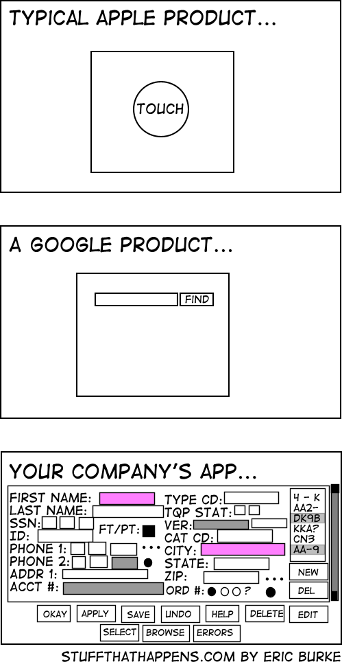
And no, I will not tell you what my company app is.
You must log in or register to comment.
Google and apple already know who you are, the company at the bottom doesn’t
Lol, that’s a fun angle. They don’t need all those fields coz they just get your information the other way
The company app is for actual work, the others are for instagram and netflix
Wrong, the google product is dead
And the Apple product would probable say “gloat about me to your friends”
And it was one they bought, just to kill it… Google: the sadist of the tech world.
People at my company are like “why are we wasting screen real estate with white space?” and I imagine they see the last image is an ideal UX
We’re currently trying to convince our client, that 4 different levels “mandatory” fields in a form are about two too many.
The UI they sketched looks like shit, but they think it’s absolutely necessary.
But there was this one customer, where it was so helpful to know he’s left handed. So now this is a necessary information /s
And then the logging shows that nobody uses half the fields, but the business won’t let you remove any.
Apple/Google/Other Companies way, way over-do this. Clean, modern design is one thing, but avoiding all text, making things too small to see, and being unable to tell which option is highlighted, etc, all at the expense of the actual UX is such an annoying trend and I’ll never like it.
I’m a Millennial so of course I don’t have a lawn, but get off it anyway…
For the first two you need hoops and tricks for it to do what you want, the last one has bad UX. I choose the later.
I would argue that the first two require you to jump through hoops for edge cases, while the last one requires you to jump through hoops for every case.
Without knowing what the user is actually doing, that’s impossible to know. If the user has to input all those fields on a regular basis, then that one screen is the superior UX.
They’re right
The flipside is that all of the stuff you actually use is buried five levels deep.
And the flip side of that is that the stuff you actually use is spread over 5 pages worth of scrolling and requires you to read like 100 labels until you find the text boxes you want
There is a clear difference here: the first software, you pay to use. The last one, you get paid to use it.
100% this. I used to work at a company that sold software that mechanical engineers used all day, every day in a certain field. Our app looked like the last pic but with better alignment.
People who are competent want all the things on their screen all at once all the time. They also want keyboard shortcuts.
An automation API would also be nice please… (i hope it doesn’t require an additional $4000/y licence)
I think there’s a balance and I would say it looks like autocad. It can be annoying to use but holy hell when you know what you’re doing. Low floor, high ceiling, and rarely gets in your way
I hope that’s a power user app, right? RIGHT!?!
No it logs the days u showed up so it can deduct from ur salary upon missing 2.3minutes of your shift
The developer who made it was forced to make it in 1 week because the company said it is a simple app and paid less than minimum wage
Also it uses Times New Roman font because companies believe it is the only font in existence and should definitely be used in UI instead of fonts meant for UI like Segoe UI on Windows which has UI in its name
There’s a difference between software that’s designed to be easy for people that haven’t seen it before and software that’s meant to be used by someone that’s been trained to use it.
Yes and no. I did build several in-house enterprise applications and for this I know about this problem. And yes you’re right, a lot of the complicated contexts are more complex than searching on Google.
But! Enterprise software architects have a tendency to make every feature as visible, and also making the apps as feature rich as possible. This comes with high costs.
I always try to establish a strive with exactly what google delivers.
Cage the user in his first decision, Filter or action and then show him or her the application with all the features feasible in the chosen context. It is amazing how complexity reduced most of these applications are when you just ask this first question.
Please remind Microsoft of this as they continue to “improve and modernize” windows.
Can’t even use keyboard shortcuts to save a damn picture in paintbrush.
What the heck is paintbrush?
It’s called Paint now. Back in the old days it was called Paintbrush. It’s an anachronism.
FWIW MS has Paint 3D now and will probably have Paint 365 and Paint Series X before we know it.
It was always called Paint. Paintbrush is the Mac equivalent

Hmm so back in Windows 3.1, Wikipedia said paintbrush was a Mac app from the early 90s.
MS Paint
I think it’s more a case of needing to be idiot proof and provide the correct answer every time. Some people using it may have been trained but they also may be absolutely useless at using technology. Google may be simple but it doesn’t give you exactly what you’re looking for and all the relevant information on the first attempt.
Whoever made this has never used Google Cloud Platform.
You forgot the ads on google
Ngl I prefer said company app rather than “new” stuff which runs on Electron and breaks just from looking at it
Fuuuuuuuuck Electron
I worked for a big Euro bank for a bit and that was exactly it. JS timeouts were forbidden, so no animation to tell you something was finished, you had to keep clicking a Refresh button to know. In 2022.
And the colleagues who had been there a few years were actually defending this shit. Stockholm Syndrome is what it is. There wasn’t a day I didn’t complain about their piece of garbage of an intranet.
I’m so glad it’s behind me.I’m not really sure why both first name and city are required but I hate oversimplified mobile designs. Whenever a web page loads everything into a big rounded edge middle column I do a little angry exhale.
I’m an adult with a mouse and keyboard, I don’t need giant baby buttons and you can load more than two rows of something at a time ffs.
Lazy Web devs who took the ‘mobile first’ mantra to mean ‘mobile only’ 🙄
more checkboxes == more better

I actually kinda like that one.
hey this thing was great back in the day
Oh god I know 3rd party encoders like this from from my tape flipping days. They’re some sort of dark sorcery you never question. Just press “will try to play or encode” and then make the appropriate sacrifice at your altar.
I don’t understand, what did poor codecs and bitrates do wrong to deserve such harsh treatment, viciously denied checkbox privileges forever destined to a pleb drop-down menu :'(
Those are radio buttons, tho. But nice work with fieldsets 👍
I loved making interfaces like that for internal systems in the past. I’d find a way to put everything relevant on the screen and able to be read or interacted with any time it’s necessary. I also had it flow top to bottom and left to right, because there was typically a physical process step associated with that station.
- Those apps are simple
- Those apps target a wide audience, hence have more budget as a result
- Those apps are made by large, well oiled (you’d hope at least) companies. You don’t want my honest opinion on most small software development boxes. This industry grew faster than mentors became available for the newbies, so many devs including seniors still don’t know what they are doing.
So so incredibly true. I provide Admin support for folks that want to publish apps with Apple and let me tell you, it’s the wild fuckin west out there and I’m not even talking about the coding part which I’m sure is a hellscape if my side of things is anything to go by.
Mom and pop got an app idea for passive income so they just hire a company to publish it for then, usually from India, with devs who can’t put two and two together because they work for assholes that want apps pumped out asap. They don’t want critical thinkers, they don’t want knowledgeable employees, what they want are tons of employees they can take advantage of as cheaply as possible that can do a good enough job to stay afloat and make them money. These guys know basic code and nothing else nor do they seem to want to know how to actually manage a development team, they seem like they are under a lot of pressure. I personally don’t actually code or know how to code outside of basic HTML Myspace bullshit but I do know how to get shit published and I know how to get the apps ready for publishing. I know these things because our guides are massive and massively detailed with screenshots to help you out and yet I’m busier than ever. 90% of my job outside of the admin and fraud prevention work I have to do is sitting on the phone reading instructions word for word or copying and pasting it from the guides for people who should be able to understand the content, but they don’t.
Imo as someone that’s been doing this for 5 years now, it’s a bubble and she’s ready to burst. It’ll be another .com crash that we’ll all pretend we didn’t see coming.
This, but trying to slap all of that into a ‚new‘ react app while not hardcoding every damn input.


