Corel Linux first launched in 1999, from the same company that at the time owned the WordPerfect word processing software. While it was made to compete with Microsoft's Windows it quickly died off.
KDE can look like pretty much anything. The default layout is generally Windows like with a lower panel with a menu and task bar to the left and a system tray to the right.
Windows 11s big “innovation” is centring the task bar and start menu. In the latest version of windows 11 you can finally move it back to the left. KDE can already centre both or move to the left and much more. There are also windows 11 global themes in the KDE library, I’ve not tried them though.
Windows 11 is otherwise not that different from windows 10. KDE already has all the graphical bells and whistles, and has long had a unified settings menu, and has way more flexibility for changing up the layout (it can be Mac like or old gnome like, or gnome 3 like or custom).
A lot of the gnome 2 based WMs are also very flexible - xfce, cinnamon, etc. I’ve never used Gnome 3 - I assume it’s similar?
The blend between blur and transparency that Windows uses is a bit special, you can’t really get it on Linux I think. I use Blur My Shell for some cheap fancy effects, but it’s nothing close to the shades Microsoft came up with.
I still prefer Aero over its replacement, but I can see the appeal. Gnome and KDE just don’t seem to have a distinctive GUI blur effect the same way Windows has (or Apple macOS/iOS has, for that matter).


Ok, KDE looks most like Windows 10 to the best of my knowledge, what looks most like Windows 11?
This is a 10 minute effort but I think you can push this even further to make it look like Windows 11 on KDE
Wow, that’s really cool, what did you do?
I installed OnzeMenu and EventCalendar via the settings > add widgets. The Windows 11 theme and Icon on Settings > appearance.
If you right click the KDE menu icon from the taskbar, there is an option show alternatives, pick OnzeMenu from that. Same case goes to the time/date.
That wallpaper is beautiful, could you share the source?
It’s a default wallpaper on KDE. The name is Safe Landing but to save you the hassle, here you go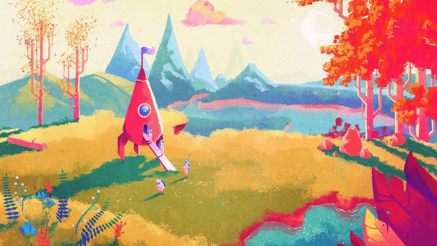
KDE can look like pretty much anything. The default layout is generally Windows like with a lower panel with a menu and task bar to the left and a system tray to the right.
Windows 11s big “innovation” is centring the task bar and start menu. In the latest version of windows 11 you can finally move it back to the left. KDE can already centre both or move to the left and much more. There are also windows 11 global themes in the KDE library, I’ve not tried them though.
Windows 11 is otherwise not that different from windows 10. KDE already has all the graphical bells and whistles, and has long had a unified settings menu, and has way more flexibility for changing up the layout (it can be Mac like or old gnome like, or gnome 3 like or custom).
A lot of the gnome 2 based WMs are also very flexible - xfce, cinnamon, etc. I’ve never used Gnome 3 - I assume it’s similar?
Windows 11, in terms of design changes, seems to draw inspiration from KDE and Gnome.
The Win11 start menu changed and looks more like the KDE Plasma one, albeit centred like the Gnome app grid.
They’ve switched to rounded corners, like Gnome.
They now use dots to denote pages, like Gnome does all throughout their system.
To me, the overall system in Win11 seems like it’s been made more like KDE, but the smaller nuances seem more Gnome-inspired.
Microsoft is no stranger to copying Linux DEs, remember KDE Plasma’s motto in 2017? “Simple by default. Powerful when needed.”
Compare that to Microsoft’s totally not stolen tagline they used to promote 11: “Simple by default. Powerful by choice.”
Lol, I use GNOME daily, and I didn’t notice the inspiration until now. I think Windows 11 uses a lot more transparency and blur than KDE or GNOME.
The blend between blur and transparency that Windows uses is a bit special, you can’t really get it on Linux I think. I use Blur My Shell for some cheap fancy effects, but it’s nothing close to the shades Microsoft came up with.
I still prefer Aero over its replacement, but I can see the appeal. Gnome and KDE just don’t seem to have a distinctive GUI blur effect the same way Windows has (or Apple macOS/iOS has, for that matter).